All projects · Shakira Perfumes / Puig
Shakira Perfumes
Over ten years, three versions, one brand that can't lose its character.
- Client
- Shakira Perfumes / Puig
- Year
- 2015 – present
- Industry
- Perfumery / Luxury
- Role
- PM · UX-UI · Development
- Versions
- 3 sites
- Format
- Brand website · E-commerce
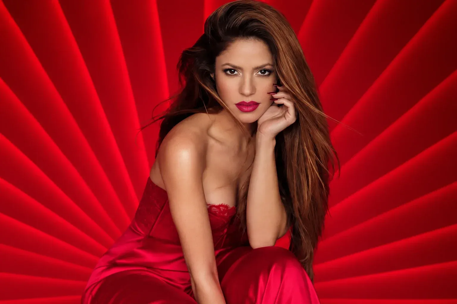
Context
For almost a decade, Cyberdelia drove the digital evolution of Shakira Perfumes — a global fragrance line that needed a digital experience worthy of its brand.
The challenge wasn't just redesigning a site. It was keeping a very strong visual identity coherent across three generations of web technology, adapting to new consumer behaviour, new markets and new collections — without losing the brand's character.
Screens
Data shown is anonymized.
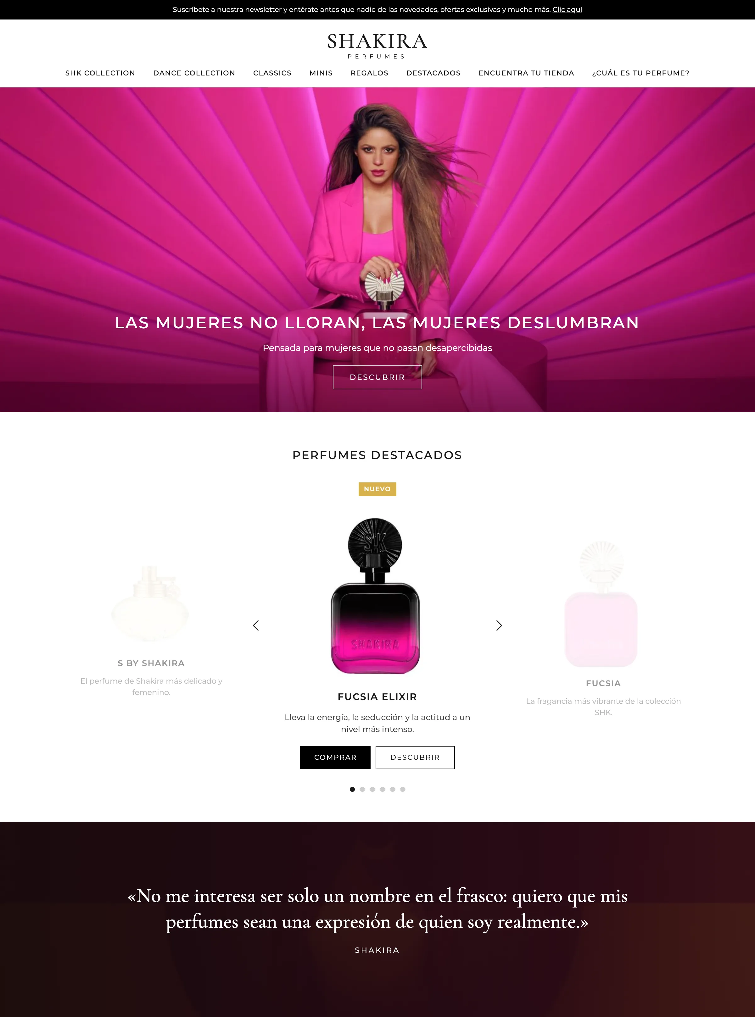
Home
Full-screen campaign, featured perfumes in a carousel and Shakira’s own voice as a quote.
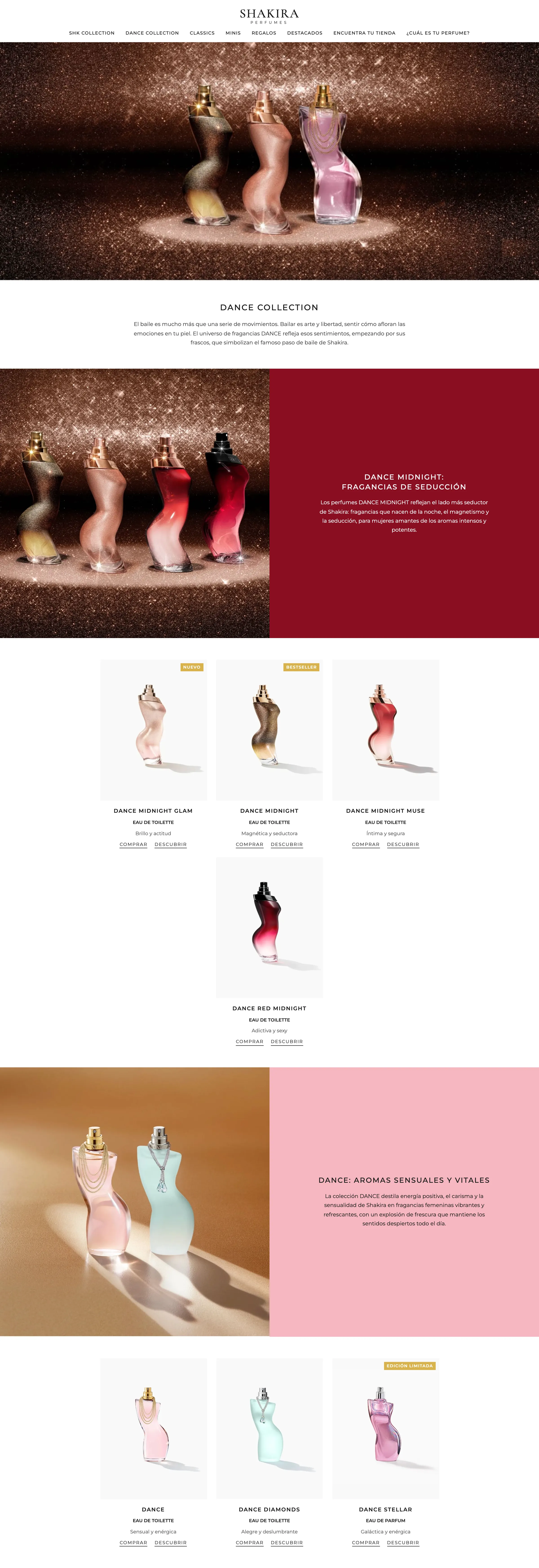
Collection page · Dance
Each line alternates a mood image with a color block that explains it, followed by its fragrances with new or limited-edition labels.
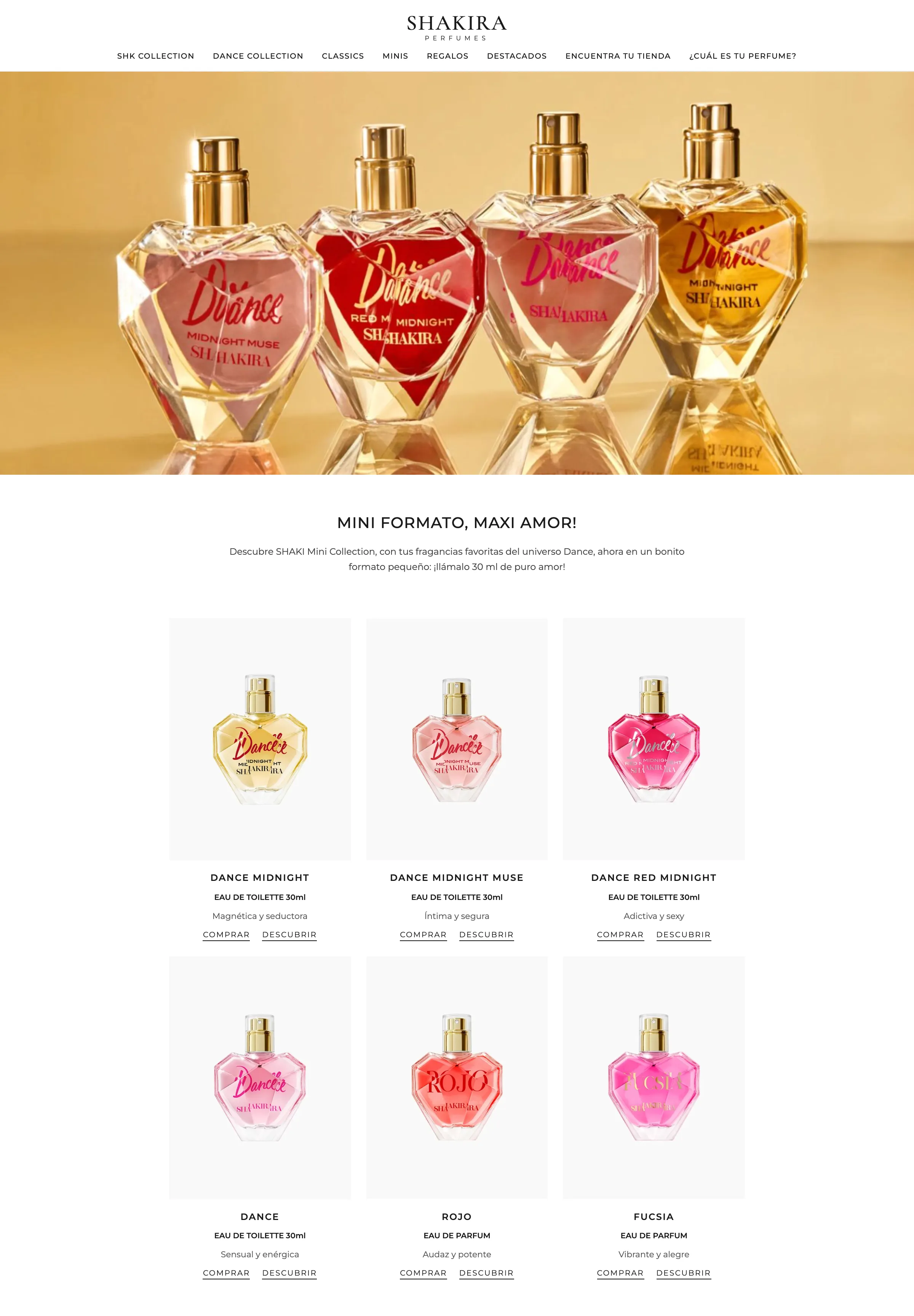
Minis
The 30 ml collection, with a product hero and a grid of the six fragrances.
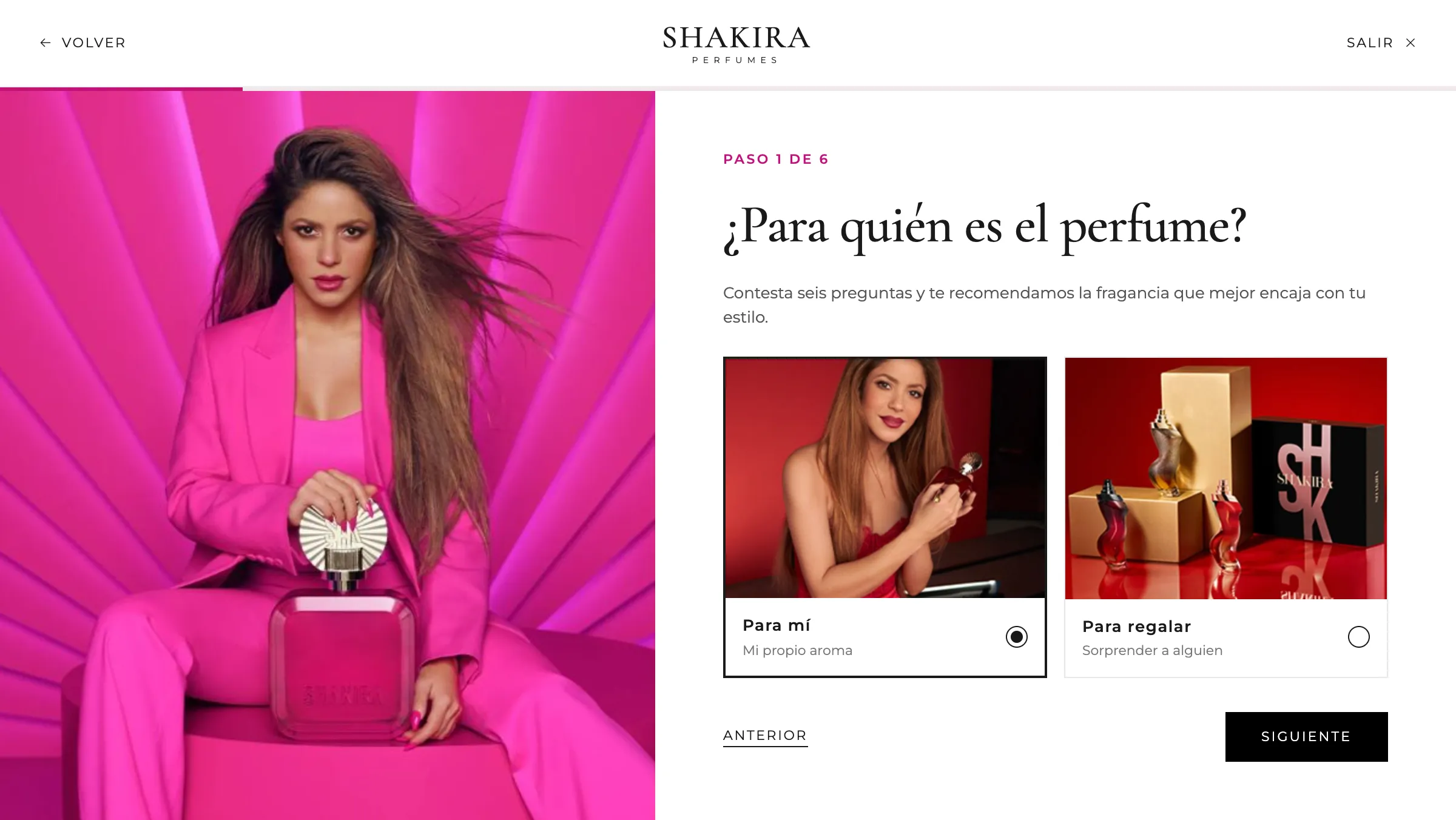
Which perfume are you?
The quiz goes from a row of numbered circles to a full-screen experience: progress bar, a fixed campaign image on the left and visual options with clear selection.

Scent families
Floral, fruity, oriental or gourmand: pick up to two.
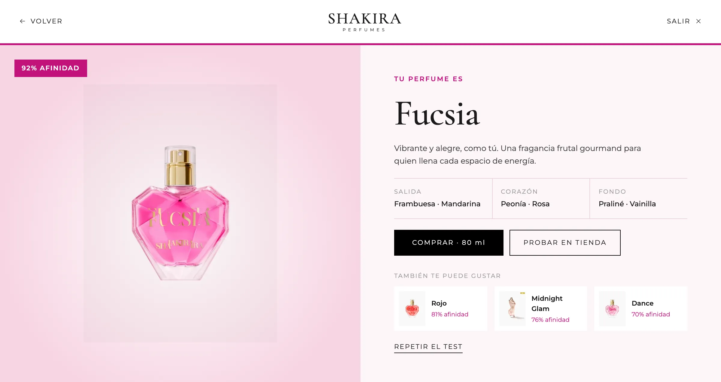
Result
The recommended fragrance with its affinity, olfactory pyramid and alternatives.

Mobile home
The campaign and featured perfumes, built for the thumb.
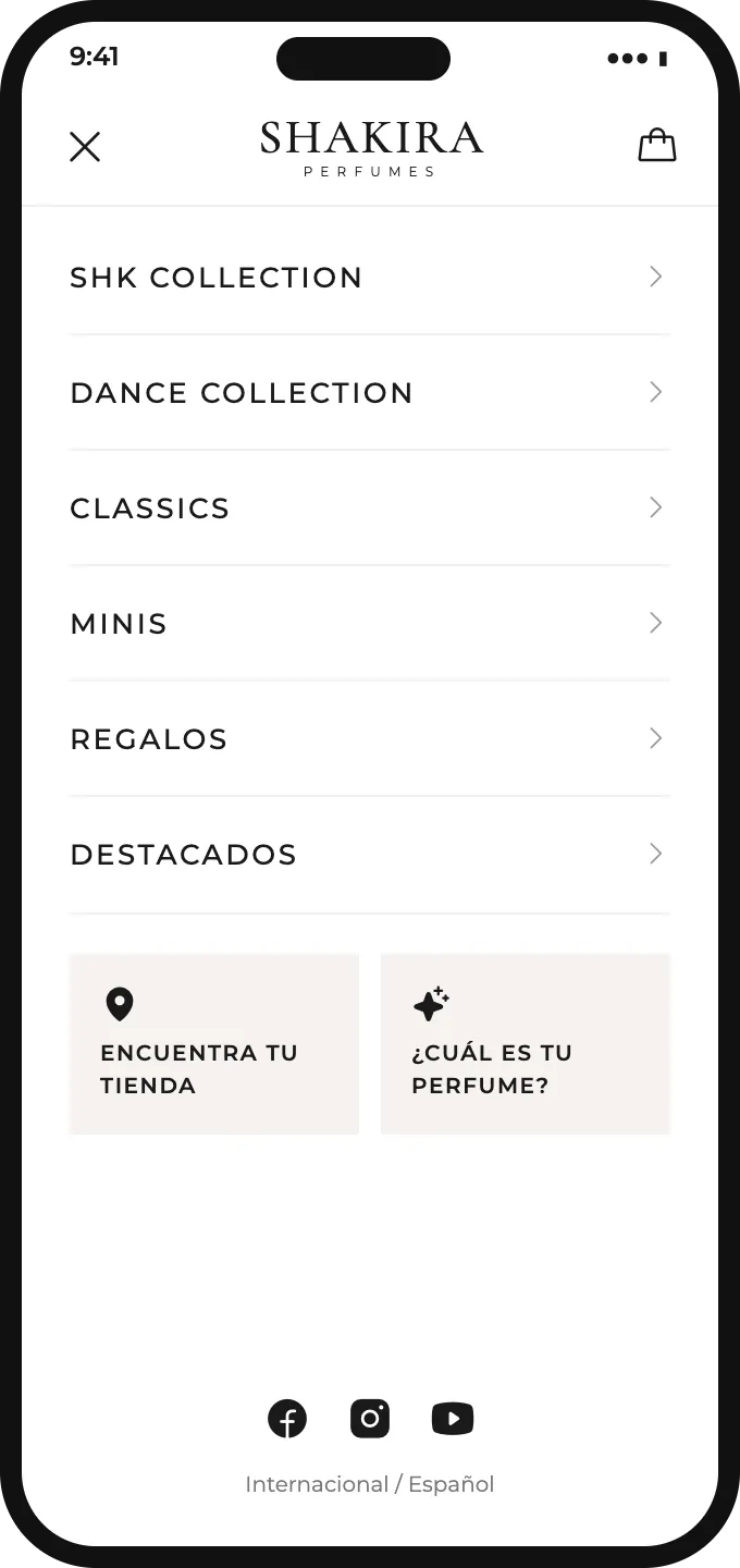
Menu
Collections as a list, store and quiz as highlighted shortcuts, socials at the bottom.
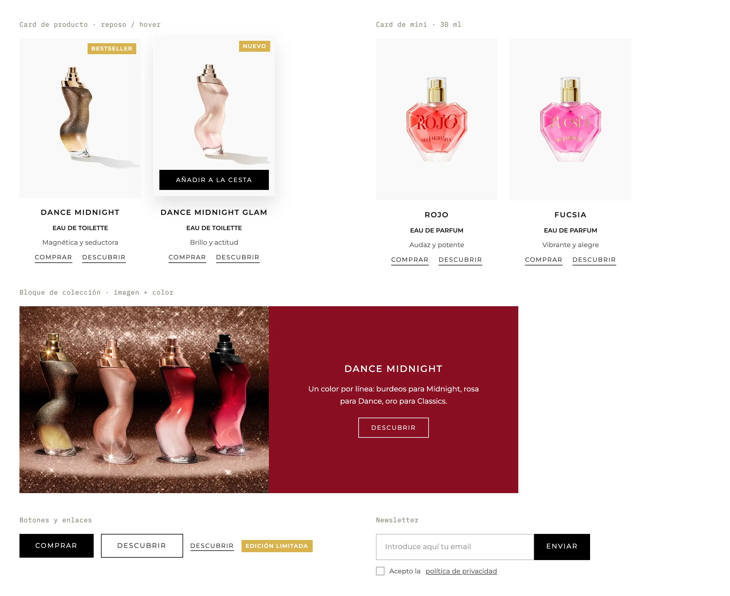
Components
The pieces repeated across the site: product card at rest and on hover, mini card, collection block, buttons and newsletter.
What we built
Collections
Each line alternates a mood image with a color block that explains it, followed by its fragrances with new or limited-edition labels.
Product carousel
Featured perfumes in a carousel with direct purchase and access to the product page.
Full-bleed campaign video
Each campaign hero takes the whole screen, like a commercial.
“Which perfume are you?” quiz
Six full-screen questions with a progress bar, visual options and a result with affinity score, olfactory pyramid and alternatives.
Store locator
Find the nearest point of sale in every market.
2015 — first digital presence
First version
The starting point
The first version arrived when the brand needed an online presence consistent with the global image it already had offline.
An accessible product catalog, a solid visual identity and an experience that worked across the main markets. Desktop-first, with a simple content architecture and obsessive visual detail.
- Stack
- HTML5 / CSS3 / jQuery
- Markets
- ES, UK, FR, IT
- Approach
- Desktop-first
- Products
- Launch line (4 fragrances)
2019 — new architecture, new visual language
Mobile-first redesign
The shift
By 2019 mobile had overtaken desktop in key markets. A responsive patch wasn't enough — the experience had to be rethought from scratch.
The new version introduced a proprietary design system, scroll animations, deeper editorial product pages and support for several live collections at once, fully localized for 8 markets.
Design system
Reusable components, systematic typography and tokens to adapt each campaign's look without breaking coherence.
Localization × 8
Prices, currency, copy and visual assets adapted per region.
Performance
Initial load under 2s. Lazy-loading, inline critical CSS and aggressive static caching.
2023 — full rebuild on a modern stack
Current version
The challenge
New collections, an evolved visual identity, and immersive experiences had become the standard in beauty.
A full rebuild on Laravel and vanilla JavaScript, with no frontend framework: a cinematic video hero, scroll-driven transitions and richer product pages — olfactory notes, ingredients, campaign stories. With content management so marketing runs it with full autonomy.
- Stack
- PHP Laravel · JavaScript vanilla
- Markets
- 12, fully localized
- Performance
- Core Web Vitals green · LCP < 1.8s · CLS 0
- SEO
- Per-product metadata, sitemap, rich snippets and structured data
Stack
- PHP
- Laravel
- JavaScript
Learnings
Over ten years and three versions teach more about digital product than many greenfield projects. Keeping a strong brand intact while technology shifts around you takes architecture decisions that rarely get documented well.
The key in every iteration was never assuming that what worked before still held. Each redesign started from real behavioural data — what people visited, where they dropped, what they searched for — not aesthetic assumptions.
Today the site handles global campaign traffic, the brand team runs it autonomously, and the visual coherence has held since day one.
Visual system
Gallery white, luxury black, and the bottle brings the color. One color per line: burgundy for Midnight, pink for Dance, gold for Classics.
- Black#000000
- White#FFFFFF
- Gift pink#F3D6CF
- Gold#D8B24C
- Footer sand#D9D3CC
- Shakira
Cormorant
Logo and quotes
- DANCE
Montserrat
Spaced titles and body text